Hooked by Hue: What Cult Cinema Knew About Color That Silicon Valley Spent Billions to Rediscover
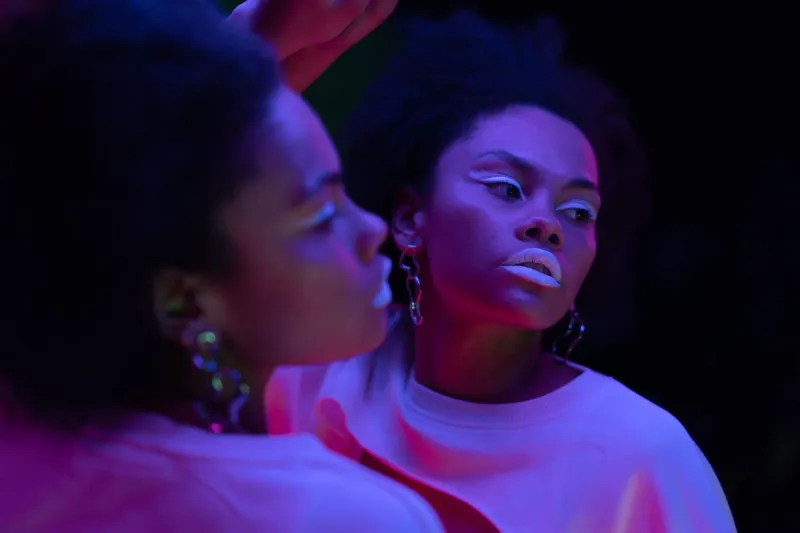
Somewhere between the third scroll and the fourteenth notification, your brain stopped being yours. You probably blame the app. Fair enough. But the real architects of that dependency were working in 35mm long before anyone had a smartphone to stare at. Cult cinema — grimy, neon-soaked, operating way outside the Hollywood machine — figured out the psychology of color addiction with almost no budget and zero corporate research departments. They just had instinct, desperation, and a whole lot of magenta gel.
The Screen Was Always the Trap
Let's back up. The idea that color can manipulate mood isn't new — it's ancient, honestly. But cult filmmakers in the late 1970s through the 1990s weaponized it in ways that mainstream Hollywood largely ignored. Where big-budget productions leaned on narrative and star power to hold attention, low-budget genre directors had to grab you by the optic nerve and refuse to let go.
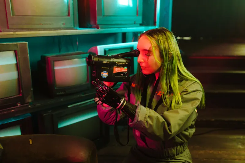
Take the visual language of films like Suspiria, Manhunter, or Blade Runner — works that existed at various points on the cult spectrum. Each one used color not as decoration but as neurological bait. Deep crimsons bleeding into electric blues. Acid greens flickering against pitch-black backgrounds. These weren't random aesthetic choices. Directors and cinematographers were, consciously or not, exploiting the way the human visual cortex responds to high-contrast, high-saturation environments: with heightened alertness, elevated emotional arousal, and a kind of compulsive attention that's almost impossible to voluntarily disengage.
That last part — the involuntary attention — is the whole ballgame. It's what every social media platform is chasing right now.
Neon as a Neurological Hook
Here's the science, stripped down: the human eye evolved to treat bright, saturated colors as signals of importance. Ripe fruit. Fire. Blood. Danger. Opportunity. Your visual system is hardwired to prioritize those inputs above almost everything else. Cult cinema directors, many of them working from pure intuition, built entire visual systems around exploiting that response.
Dario Argento didn't read neuroscience journals. But watch the lighting design in Suspiria — the way rooms shift from deep amber to violent red without any logical in-world source — and you're watching a man who understood, in his gut, that the human brain cannot look away from saturated light. It creates a low-grade anxiety, a persistent alertness, a sense that something important is happening even when the narrative pauses. The color is the tension.
Michael Mann did something similar but colder in Manhunter. Aquamarine and white fluorescence against night-black environments. The palette feels sterile, almost clinical, but it produces a specific kind of unease — the same unease you feel scrolling a perfectly designed app at midnight, everything illuminated just a little too brightly for the hour.
That's not a coincidence. That's color science doing its job.
Silicon Valley's Debt to the Grindhouse
Fast forward to the early 2010s. Social platforms were hiring teams of behavioral psychologists, neuroscientists, and UX designers to figure out why some interfaces felt sticky and others didn't. What they kept landing on — through expensive research and endless iteration — was a set of principles that any cult film obsessive could have sketched on a napkin.
High-contrast notification badges in red and orange. Infinite scroll interfaces bathed in bright whites and electric accent colors. The specific blue of Facebook, Twitter, and countless other platforms — a hue chosen in part because it reads as alert and active across the widest range of human visual perception. These weren't arbitrary decisions. They were the product of billions of dollars chasing the same psychological lever that neon-drenched cult cinema had been pulling for decades.
The notification dot is a magenta gel over a practical light. The infinite scroll is a tracking shot through a neon-lit corridor that never quite ends. The dopamine hit from a like is the jump scare you didn't see coming because the color palette had your nervous system primed and ready.
The Cult Audience as Beta Test
What makes the cult cinema angle particularly fascinating is the audience dynamic. Cult film communities didn't just watch these movies — they returned to them obsessively, memorized them, built identities around them. That kind of compulsive re-engagement is exactly what platform designers dream about. And it was color, as much as narrative, that drove it.
There's something about a truly saturated, neon-heavy visual environment that lodges in memory differently than naturalistic imagery. Brain imaging research has confirmed what cult fans always felt: high-saturation visual experiences produce stronger emotional encoding. You remember them more vividly. You want to revisit them. The image of Blade Runner's rain-slicked streets glowing in amber and electric blue doesn't just stay with you — it becomes a craving.
Social platforms figured this out and industrialized it. Every carefully chosen interface color, every glowing notification, every algorithmically timed burst of visual reward is running the same play. They just scaled it to three billion users.
What Cult Cinema Still Does Better
Here's the thing, though — there's a meaningful difference between what cult filmmakers were doing and what tech platforms do now. The cult director was, at some level, creating an experience. Even the most manipulative visual design in Suspiria or Manhunter exists in service of something: dread, beauty, a specific emotional truth. The neon was a tool for expression, however exploitative the expression sometimes got.
Platform color science has no such ambition. It's pure extraction — designed to maximize time-on-screen without any corresponding emotional or artistic payoff. The hook without the fish. The corridor without the destination.
That distinction is part of why cult cinema communities keep growing while platform satisfaction keeps declining. People are hungry for the version of this experience that actually delivers something on the other side of the manipulation. They want to be hooked by something worth being hooked by.
The Neon Stays On
So the next time you catch yourself unable to look away from a particular scene — the pink and green neon of some rain-soaked future city, the pulsing crimson of a horror corridor, the cold aquamarine of a thriller's sterile interior — know that you're experiencing the original version of something that was later mass-produced and stripped of its soul.
Cult cinema cracked the color code first. It did it with practical lights, colored gels, and filmmakers who cared too much about the image to ever let it go flat. Silicon Valley spent a fortune figuring out the same principles and used them to sell you ads.
We know which version we prefer. And we're pretty sure you do too.