They Drew the Future First: How Cult Cinema's Visual Architects Built the World Gen Z Calls Its Own
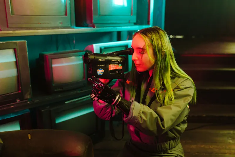
Scroll through TikTok for ten minutes and you'll notice something strange. The color palette feels familiar in a way that's hard to pin down — magenta bleeding into teal, overexposed whites crashing against deep shadow blacks, neon signage reflected in rain-slicked surfaces. It looks cutting edge. It looks now. Except it isn't. Not even close.
That aesthetic has a birthplace, and it's not a social media trend house or a fashion week moodboard. It's a collection of cult films made between roughly 1980 and 1998 by production designers who were considered too weird, too maximalist, and too expensive for what little they were actually paid. These were the people building other worlds on sound stages in Burbank and Vancouver, arguing with directors over which shade of magenta best communicated existential dread. They were operating completely outside the mainstream, and the mainstream has been catching up ever since.
The Color Language Nobody Credited
Let's start with the obvious: the neon. Not just neon as decoration, but neon as grammar. In films like Blade Runner, The Crow, Strange Days, and a dozen lower-budget neo-noir titles that barely cracked a thousand screens, production designers made a specific and deliberate choice to use artificial light as the primary emotional carrier. Natural light was unreliable, warm, and — crucially — legible. It told you exactly where you were. Artificial neon created ambiguity. You could be anywhere. You could be nowhere.
That ambiguity is exactly what makes a TikTok backdrop feel aspirational today. The neon sign behind a creator's head doesn't just illuminate — it displaces. It signals that the space you're looking at exists somewhere outside ordinary geography. Cult cinema production designers understood this forty years ago. They were using it to build dystopias. Gen Z is using it to build personal brands. The tool is identical.
Specific color pairings that recur obsessively across cult cinema — magenta and cyan, amber and violet, acid green against matte black — are now the default presets of photo editing apps and the signature palettes of streetwear drops. Nobody officially licensed them. They just migrated, the way aesthetic languages always do, through cultural osmosis and the slow drip of influence.
Typography as Architecture
Here's something production designers understood that graphic designers took years to catch up on: in a world saturated with visual noise, typography isn't signage. It's structure. The chunky, slightly degraded, neon-outlined letterforms you see in cult film title sequences and diegetic signage weren't chosen because they looked cool. They were chosen because they communicated a specific relationship between language and environment — one where text feels almost biological, like it's grown out of the walls rather than been placed on them.
Look at the font choices dominating cyberpunk fashion drops right now. Look at the typographic layering in high-concept music videos. Look at the way luxury brands have started using distressed, glitchy lettering to signal edge. Every single one of those choices traces a direct line back to production designers who were sketching set dressings for films that played at midnight in half-empty theaters.
The irony is sharp: the aesthetic was born from scarcity and weird creative freedom. It's now being deployed to sell five-hundred-dollar hoodies.
Spatial Geometry and the Architecture of Everywhere
Beyond color and type, there's something harder to name but equally influential: the shape of cult cinema spaces. Production designers in this era were obsessed with layering — foreground clutter, midground activity, background depth. Frames were never clean. There was always something happening at every plane of the image, some piece of signage or machinery or architectural detail demanding attention.
This visual density was partly a practical workaround. Smaller budgets meant smaller sets, and filling the frame created the illusion of a larger world existing just off-screen. But it also produced something genuinely new: environments that felt inhabited in a way Hollywood's clean, legible spaces never did. They felt lived in to the point of overwhelm.
Now look at the metaverse concept art that tech companies have been releasing for the past few years. Look at the virtual environments in AAA video games. Look at the layered, cluttered, maximally detailed digital spaces that designers are building for immersive experiences. The spatial logic is the same. Depth, density, controlled chaos. The production designers of cult cinema were building proto-metaverses on physical sets, and the people designing actual virtual worlds are — whether they know it or not — following their blueprints.
The Unacknowledged Inheritance
What makes all of this genuinely interesting rather than just a fun trivia point is the question of why the credit never traveled with the influence. Part of it is structural — production design is one of cinema's least-celebrated crafts, even within film culture itself. Directors get canonized. Cinematographers occasionally break through. Production designers mostly don't, even when they're the ones actually building the world you're watching.
Part of it is also the cult cinema factor. These weren't prestige films. They weren't awards contenders. They were midnight movies, straight-to-video releases, genre pictures that mainstream critics dismissed or ignored entirely. The designers working on them weren't building careers through industry recognition — they were building things, physical objects and spaces that had their own internal logic and visual integrity regardless of whether anyone important was watching.
That outsider status is exactly what gave them freedom. When you're not making a film that needs to appeal to a broad audience, you can go further. You can be weirder. You can make choices that feel wrong by conventional standards because conventional standards aren't the game you're playing. And those extreme choices — the ones that seemed too much, too strange, too loud — are precisely the ones that aged into icons.
What Collectors Already Know
Ask anyone who's been deep in cult cinema collecting for a while and they'll tell you the same thing: the production design is often the reason they keep coming back. Not just the story or the performances, but the world — the specific texture of a particular film's visual reality that you can't find anywhere else. That's why limited-edition Blu-ray releases sell out when they include production design galleries and art books. That's why original prop and set piece auctions draw serious money. Collectors understand, intuitively, that what they're preserving isn't just a movie. It's a design document for a possible world.
Gen Z didn't invent maximalist neon aesthetics. They inherited them from people who were considered too weird to matter, working on films that weren't supposed to last. The fact that those films — and those visual choices — have outlasted almost everything that was considered more important at the time is the most cult cinema thing imaginable.
The neon prophets were right. They just never got the byline.