Painting With Light Before Photoshop: The Analog Color Alchemists Who Built Cult Cinema's Visual Language
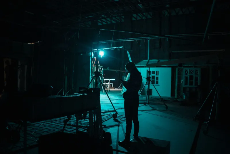
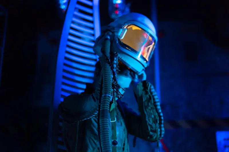
Somewhere between a magenta-soaked hallway and a sodium-vapor streetlamp bleeding orange through a rain-slicked window, cult cinema found its soul. That look — the one that makes your eyes feel like they're being gently fried in neon — wasn't born in a software suite. It was wrestled into existence by cinematographers working with physical light, chemical baths, and a stubborn refusal to let reality dictate what a frame should feel like.
We talk a lot about directors. We talk about synth composers. But the color architects — the directors of photography who turned low-budget limitations into a visual philosophy — rarely get their flowers. That changes now.
The Gel Revolution Nobody Talks About
In the 1970s and into the 1980s, a wave of DP's working on the fringes of Hollywood discovered something that seems obvious in retrospect: colored gels placed over practical lights didn't just change the mood of a scene. They changed its meaning.
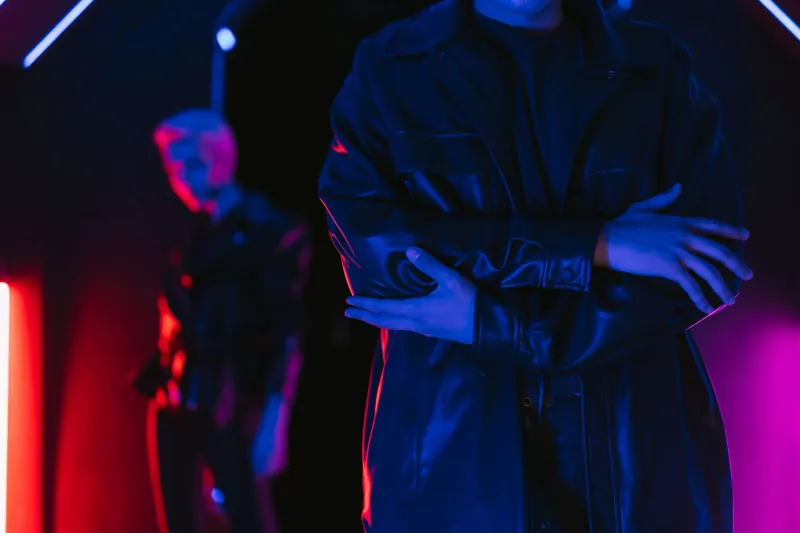
A blue gel over a single practical source in an otherwise warm room doesn't just look cool. It tells you something is wrong, or alien, or deeply unknowable. A deep magenta bleed across a face makes a character feel simultaneously glamorous and endangered. These weren't accidental discoveries — they were the result of cinematographers studying painting, theater lighting, and early Technicolor films and asking what happens when you push those techniques into spaces they were never designed for.
Cult horror and sci-fi were the perfect laboratories. Studios weren't watching closely. Budgets were small enough that experimentation was sometimes cheaper than conventional solutions. And the audiences — the midnight crowd, the drive-in regulars, the VHS devotees — were hungry for something that felt different from the flat, naturalistic look of mainstream cinema.
Push Processing and the Chemistry of Dread
Gels were only part of the toolkit. Some of the most striking color work from this era came straight out of the lab, through a technique called push processing — deliberately underexposing film during shooting and then over-developing it in the chemical bath. The result was increased grain, crushed blacks, and colors that took on a strange, almost radioactive intensity.
Push processing was technically a workaround for low-light situations. But in the hands of cinematographers who understood its side effects, it became an aesthetic weapon. Greens got sickly. Reds got angry. Skin tones drifted toward something that felt slightly not-of-this-world. Combined with unconventional gel choices, the technique produced images that felt genuinely unstable — like the film stock itself was scared.
This wasn't accident. It was craft disguised as chaos.
Color as Character, Not Decoration
What separated the great cult DP's from the merely competent ones was an understanding that color operates psychologically before it operates aesthetically. The human nervous system responds to hue and saturation in ways that bypass conscious analysis. A viewer doesn't think "that cyan light suggests emotional coldness" — they just feel it, somewhere below the level of plot comprehension.
The cinematographers who built the visual vocabulary of cult sci-fi and horror understood this intuitively. They weren't decorating scenes. They were engineering emotional states. A villain bathed in sickly yellow-green isn't just lit interestingly — they're coded at a primal level as wrong, toxic, dangerous. A protagonist stepping from warm amber into cold blue isn't just crossing a room — they're crossing a threshold into something unknown.
This color psychology approach predated the formalized "color scripts" that major animation studios would later popularize by decades. It was being practiced on shoestring budgets in warehouses and on location in the American Southwest and in cramped studio backlots, by people who had no academic framework for what they were doing — just a deep intuition about how light makes people feel.
The Laboratory as Creative Partner
Another underappreciated dimension of this era's color work was the collaborative relationship between cinematographers and film laboratories. Unlike digital grading — where one person sits in a suite and adjusts sliders — analog color manipulation required a genuine partnership between the DP and the lab technicians who processed and printed the film.
Some labs became known within cult film circles for their willingness to experiment. A DP could request unconventional timing — the process of adjusting color balance during the printing stage — and a sympathetic lab timer could push a print toward a cooler, more desaturated look or pump up the reds until they practically bled off the screen. This was a conversation, not a command. The best results came from DP's who understood what the lab could and couldn't do and who treated lab timers as genuine creative collaborators.
That relationship is largely lost now. It's one of the things that makes the analog era's color work feel handmade in a way that even the most skilled digital grading rarely replicates.
What the Streaming Platforms Borrowed (Without Saying So)
Here's the thing that should annoy you, or at least make you raise an eyebrow: the visual language that Netflix, HBO, and every other streaming platform uses to signal "prestige genre content" is almost entirely derived from the analog color experiments of low-budget cult filmmakers from forty-plus years ago.
The teal-and-orange look that dominated Hollywood blockbusters for a decade? It's a digital echo of the complementary color contrasts that cult cinematographers were building with practical lights and gels. The hyper-saturated neon aesthetic that defines everything from prestige horror to indie sci-fi? Straight lineage back to push-processed 35mm and unconventional gel stacks. The moody, color-consistent "look" that streaming platforms obsess over to maintain brand identity across entire seasons? That's the industrialization of what individual DP's were doing by instinct and experimentation.
The difference is that the originators were making choices in response to specific stories, specific characters, specific emotional needs. The platforms are applying the same logic as a branding exercise.
Why It Still Matters to Collectors and Cinephiles
For anyone who digs through Blu-ray releases from boutique labels, hunts down 35mm prints, or builds VHS libraries around specific visual aesthetics, this history isn't academic — it's personal. When you watch a well-preserved print of a cult classic and the colors hit you in that specific, slightly unreal way, you're experiencing the result of real decisions made by real people working against real constraints.
That's worth knowing. It changes how you watch. It makes you notice the gel stack in the background of a motel room scene, or the way a practical light source is colored in a way no real-world fixture would produce. It connects you to the craft underneath the cult.
The neon isn't just aesthetic. It's a record of ingenuity — of people who understood that light isn't just illumination. It's argument. It's emotion. It's the difference between a movie you watch and one that watches you back.
And they built all of it before a single pixel existed.