Blueprint for the Future: The Unsung Art Directors Who Painted Dystopia Before It Had a Name
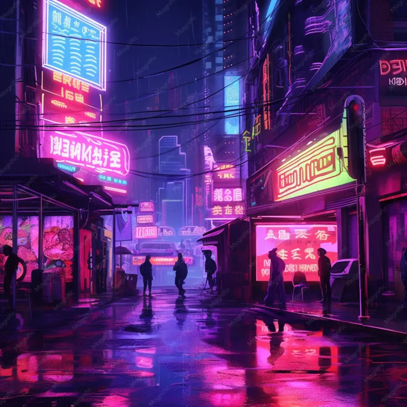
There's a particular kind of magic that happens when you rewatch a cult film from the early '80s and feel a creeping sense of déjà vu — not because you've seen the movie before, but because you're living inside it. The cracked neon signage bleeding onto wet pavement, the brutalist towers wrapped in advertising screens, the fluorescent-lit corridors that feel simultaneously corporate and apocalyptic. We scroll past versions of that imagery every single day. But somebody had to dream it up first.
Those somebodies were the production designers and art directors of cult cinema — and almost nobody talks about them.
The Invisible Architects
Directors get the glory. Cinematographers get the retrospectives. But the people who physically constructed the worlds that defined an entire visual era? They tend to collect their paychecks and fade into the credits, somewhere between the gaffer and the caterer. That's a genuine cultural injustice, because what these artists did — working on shoestring budgets, raiding salvage yards, improvising with spray paint and surplus electronics — was nothing short of world-building at an industrial scale.
Take the layered visual chaos of low-budget sci-fi productions from the late '70s through the early '90s. Production designers working on films with a fraction of the budgets available to mainstream Hollywood weren't just making do — they were developing a formal language. Stacked signage in competing typefaces. Exposed conduit running alongside handwritten notices. Consumer technology repurposed as set dressing until it looked alien. These weren't aesthetic accidents. They were deliberate choices made by people who understood that a world under pressure looks cluttered, not clean.
Neon as Narrative
The neon obsession that defines so much cult cinema wasn't decorative. It was functional storytelling. Neon light is inherently unstable — it flickers, it buzzes, it bleeds color into rain and fog in ways that feel almost alive. When an art director chose to flood a scene with magenta and cyan rather than conventional film lighting, they were making a statement about the world their characters inhabited: beautiful on the surface, slightly broken underneath, always humming with a low-grade electrical anxiety.
That visual logic turned out to be remarkably prescient. Walk through any American city after dark in 2024 and you're essentially inside one of those sets. LED signage, glowing phone screens, the blue-white wash of a convenience store — it's all there. The art directors of cult cinema didn't predict the future so much as they identified something fundamental about the emotional texture of late-capitalist urban life and rendered it in phosphorescent light decades ahead of schedule.
Some of the most influential work happened on productions that barely registered at the box office. Films that played midnight slots in cities like Chicago, Austin, and New York, where audiences who actually looked at movies came to absorb them. Those viewers went on to become filmmakers, graphic designers, game developers, and architects — and they carried those images with them.
Retro-Futurism as a Design Philosophy
One of the defining moves of cult sci-fi production design was the deliberate collision of eras. Art directors would take Victorian industrial hardware and wire it into futuristic control panels. They'd dress sets with 1950s consumer appliances modified just enough to seem otherworldly. The result was a visual grammar that felt unstuck in time — neither nostalgic nor purely forward-looking, but suspended in some anxious middle space.
This wasn't laziness or budget compromise, though both sometimes played a role. It was a coherent philosophical statement: the future isn't a clean break from the past. It accumulates. It inherits. The dystopias these designers built were so convincing precisely because they looked like our world with different proportions — more surveillance, more decay, more light in the darkness.
That retro-futurist sensibility has proven extraordinarily durable. You can trace a direct line from the handcrafted analog environments of cult cinema's golden era to the aesthetic DNA of contemporary streetwear, video game environments, album artwork, and even the visual language of tech startup branding. The irony of Silicon Valley companies using cyberpunk imagery to sell products that increasingly resemble the corporate dystopias those films warned against is not lost on anyone who's actually watched the movies.
The Geometry of Control
Beyond the neon, there's another formal element that recurs across the great cult sci-fi productions: geometric severity. Long corridors that converge to a vanishing point. Circular chambers that suggest both surveillance and ritual. Grid patterns applied to floors, ceilings, and costumes until the human figures moving through the space start to resemble data points rather than people.
This wasn't borrowed from mainstream science fiction's sleek, optimistic tradition. It drew from brutalist architecture, Soviet constructivism, and the visual language of institutional spaces — prisons, hospitals, government buildings. Art directors were essentially asking: what does a world that has optimized for control rather than comfort actually look like? And they answered that question with spaces that are simultaneously impressive and suffocating.
The geometric vocabulary they developed has become so embedded in our shared visual culture that we barely register it anymore. It shows up in music videos, fashion editorials, and prestige television with the casual confidence of a design language that's been fully absorbed. But it started in the hands of underpaid art department workers building sets out of foam, aluminum tubing, and whatever else they could source from the prop house.
What We Owe the Drafting Table
There's a growing community of cult cinema enthusiasts — the kind who haunt the bonus features on boutique Blu-ray releases and hunt down production design books at estate sales — who are starting to push back against the director-centric mythology of film history. They want to know who drafted the blueprints. Who sourced the neon. Who decided that the corporate headquarters should look like a cathedral and the cathedral should look like a prison.
Those are the right questions. Because the visual language those designers created didn't just influence subsequent filmmaking — it trained generations of audiences to see the world in a particular way. To recognize the aesthetics of power. To find something simultaneously seductive and ominous in a perfectly composed grid of fluorescent light.
The next time you're rewatching a cult classic and you feel that familiar chill of recognition — that sense that the movie is describing something you walked past this morning — take a moment to think about the person who built that set. Probably working nights, definitely underpaid, absolutely visionary. They didn't just predict the future. They gave us the tools to read it.